Correlation Matrix

To create a new Correlation Matrix: on the New menu, point to Charts, and then choose Correlation Matrix.

By default, correlation coefficients shown in the matrix are calculated using trailing monthly returns converted to USD for the 3-year (36 months) time period. The calculation is performed using simple regression. Choose gross, net, or excess returns and customize the return time period to meet your research needs. Intervals of correlation values are color-coded for clear graphic representation. Positive and negative correlation coefficients are display in different colors.

4General Settings

Change the chart title and data settings.

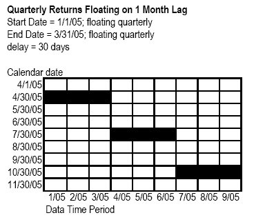
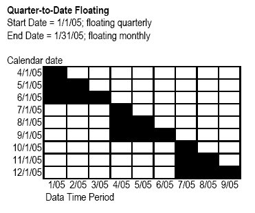
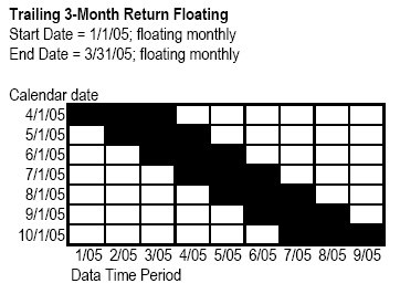
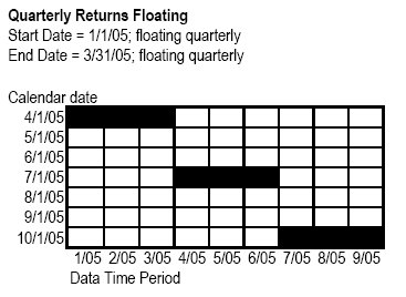
You can float the start and end dates for your analysis on a monthly, quarterly, semiannually, or yearly basis and also build lag time into the calculation. See below for some examples of how to create floating data points.

Trailing 3-Month Return Floating

Quarterly Returns Floating

Quarterly Returns Floating on 1 Month Lag

Quarter-to-Date Floating


4Investment Settings

Edit the list of investments used in the chart.

4Interval Settings

Change the color scheme and colors used to represent intervals. Under the 1-color scheme, two to five intervals are permitted, while even increments from two to ten are allowed under the 2-color scheme. The range for all is -1 to 1. Under the 2-color scheme, negative intervals will always display in one color and positive intervals in the other.

Use the Correlation dropdown to show or hide the color and numerical similarity value. Edit these settings for investments individually, or for multiple investments at the same time by selecting the investments, and then changing the appropriate settings.