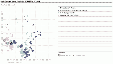
Scatterplot allows you to combine different investment attributes in a single chart to identify trends and/or trade-offs. You can select any data point including your own customized data points to define the X, Y, and Z axes. A typical application for scatterplot is a risk/reward analysis that plots risk and return statistics. In the illustration above we add a third dimension to the analysis by varying the size of the dot to represent the risk/reward coordinate for the investments over time.
Click Workspace, and then click Charts.
On the Action bar, click New, and then select a chart. In this case, we'll use Scatterplot.
Choose the investment selection method and select investments. The first 15 investments will be charted.
Select data points. The first two data points will be charted as the X and Y axis respectively. If you select a third data point it will define the Z variable which is displayed by varying the size of the symbols on the chart.
After selecting the investments and data, click OK. The chart opens in a new window.
Click Create PDF, PowerPoint or Clipboard for output. Using Clipboard allows you to paste into the application of your choice (Outlook, Word, etc).
To save the chart, click Save.